A New Chapter
Somehow it feels apropos to be writing this on the eve of the 250th birthday of America. Imagine all those years ago, the people who had come to this land for a new life, a new beginning, a new chapter. And as independence was won, so began another new chapter for this country and it’s inhabitants.
It can be scary, starting something new, something different. The not knowing what “next” will actually look like. The not knowing how it will go or what challenges will be faced.
A few years ago, a little dream was set in our hearts. It was a dream of moving somewhere less crowded, less hectic. A place where we could reconnect with nature and the kind of people we used to be before life became so crazy. And then I would think about having to leave behind my entire client base for a business I had worked so hard to get out there and I would get cold feet about actually making that change. But that little dream still existed and still tugged at my heart.
So, over the past year I started working on some new aspects of the business that could be done from anywhere. I began to make and ship custom single-use placemats designed for specific events, and I started doing virtual designs for clients that are either not local or just need help putting a cohesive design together. And as I worked on some of these new avenues, I felt less nervous about having to start over building a new client base.
And so here I sit writing, two weeks after moving to another state to start a new chapter, thinking about how it must have felt 250 years ago when our country began a new chapter. It must have felt somewhat like this - simultaneously terrifying and exciting. My location may have changed, but I’m still the same Wheeler Haus Designs that I’ve always been - committed to providing the very best to each and every one of my clients, both near and far. So cheers to all my previous clients, and here’s to meeting many new ones in the future!
The Art of Ikebana
I have long been fascinated by ikebana arrangements but have only recently taken the time to learn more about the Japanese art form of flower arranging and experiment with it on my own.
Rooted in simplicity, balance, and intention, ikebana invites us to slow down and notice the beauty in every stem, curve, and empty space.
Unlike traditional Western arrangements that often emphasize fullness and abundance, ikebana is about restraint. It’s not about how many flowers you use, but how thoughtfully you place them. Each element has a purpose.
At its heart, ikebana is a practice of harmony—between nature and the arranger, between movement and stillness. Arrangements often reflect three main elements: heaven, earth, and humanity, represented through varying stem heights and positions. But don’t let that intimidate you—this is an art form that welcomes interpretation and personal expression.
If you’re curious about trying ikebana yourself, here are a few simple tips to get you started.
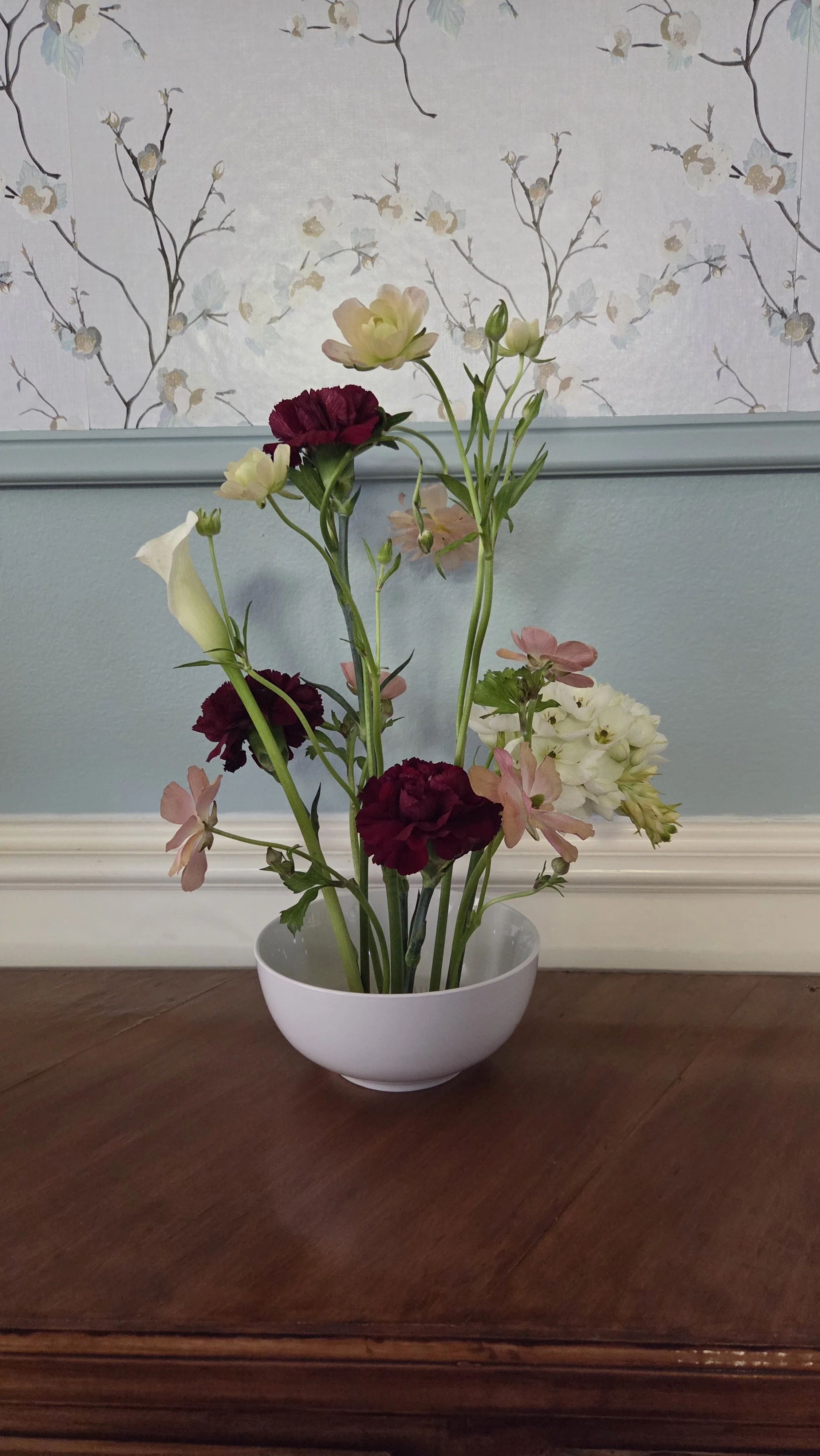
Choose a low-profile vessel. You’ll often see ikebana arrangements in a shallow bowl. To keep it inexpensive, consider using simple white cereal bowl or dip bowls (that’s what I’ve done in this photo). You’ll also want a pin frog, which is a type of floral arranging tool in which a round disc is covered with small spikes to keep the flowers in place. You can find a variety of types on Amazon. I have a few metal ones but I like the plastic ones that have suction cups on the bottom.
Next, Choose just a few stems—perhaps a branch, a bloom, and a piece of greenery. Let each one shine. In Ikebana, less is more.
Consider line and shape. Notice how a stem naturally bends or reaches. Follow its lead instead of forcing symmetry.
Embrace negative space. The “empty” areas are just as important as the flowers themselves. They create breathing room and quiet elegance. This was probably the hardest thing for me. It’s practiced editing, knowing when to remove stems to create more space. Just as I sometimes have to edit my tablescapes and remove items that don’t work so that every detail seems intentional, you have to edit your arrangement so that each stem or branch is intentional.
So how can you incorporate ikebana into your tablescapes? Ikebana arrangements are perfect for dining tables because you can create a statement without blocking sightlines or hindering conversation. Use branches, blooms, or foliage that reflect the time of year for seasonal storytelling, perfect for various special holidays and occasions.
I’ll be covering more about Ikebana in the future, as I learn and practice more, but I love this beautiful art form. Ikebana reminds us that beauty doesn’t need to be elaborate to be impactful. Sometimes, the simplest arrangements speak the loudest—inviting us to pause, breathe, and appreciate the art of less.
The Wedding Edit Part 4: Luxury in Layers
One of the previous wedding trends I discussed was the rise of the microwedding and intimate gatherings instead of grand receptions. But no matter what size wedding you have, experts agree that couples want their tables beautifully styled like a dinner party, with every detail thoughtfully curated. It really captures the shift toward weddings feeling more personal, lived-in, and emotionally rich rather than overly formal.
According to Vogue, a growing trend in wedding table settings is the use of placemats. “Similar to interior design, placemats are the new draperies. Adding that extra lush layer ties elements of the room together and offers a pop of personality.”
As one who creates custom placemats for client events, I am certainly on board with this trend, but let’s take a look at what makes it so appealing, and how you can incorporate it into your event at any price point.
Part of the appeal is that layered tables with placemats soften the formality—guests feel like they’re sitting down at a thoughtfully prepared dinner party, not a staged display. It creates that intimate mood that invites lingering conversation amongst guests, creating lasting memories.
Placemats also introduce color, texture, pattern and personality in a way chargers alone can’t. Whether it’s woven rattan, embroidered linen, or something unexpected, each layer adds depth and intention. Mixing patterns, tones, and materials creates a look that feels collected and curated.
Another upside to placemats is that it is truly something that can fit in at any budget.
For those taking a high end approach, consider custom linen placemats with monograms. There are plenty of etsy shops that offer this option. Just make sure to give the seller plenty of time to fil your order!
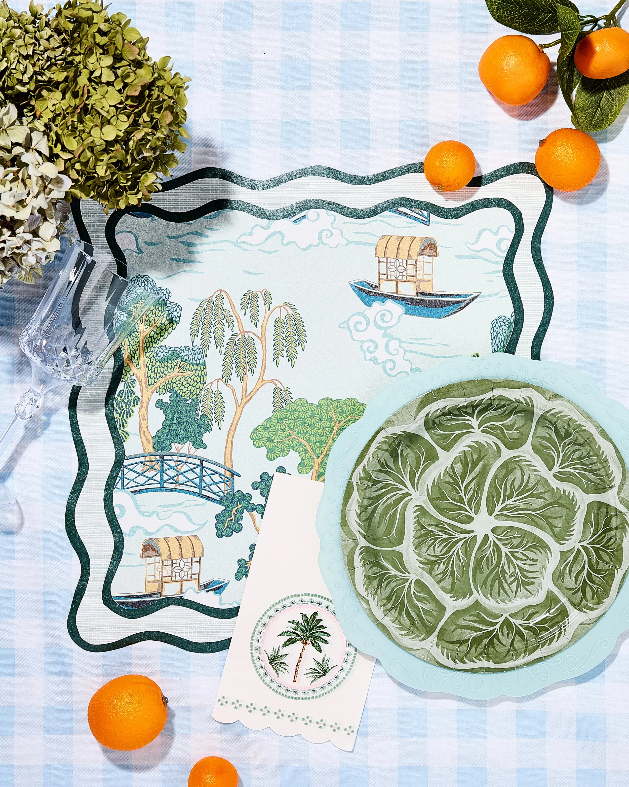
If your budget is more mid-range, there are companies that offer linen and cotton placemats in every color imaginable to complement your palette, and some even have a few patterns available. One thing that I started offering to clients to create a custom look for their event was custom, layered, single-use placemats (such as the ones pictures). It’s a great way to introduce a signature print, as well as texture and color, which really pulls the entire design aesthetic together throughout the event space.
For those on a more limited budget, there are some pre-printed, single-use placemats out there. Or, I also offer a template set that allows people to DIY their own custom, layered placemats (Every purchase comes with a tutuorial).
Placemats have the opportunity to add that unexpected element that really gives the table personality. It’s an opportunity to add unique shapes, textures, colors, and patterns to the table, elevating the table when paired with the simplicity of white dishes. If you would like more information on how to get custom layered placemats, you can book a design consultation, or you can visit my shop page to explore template set options.
The Wedding Edit: Part 3: The Rise of the Micro-wedding
As we continue to look at wedding trends, let’s discuss the rise of the Micro Wedding. In a world that increasingly values intention over excess, weddings are evolving in beautifully personal ways. Enter the micro wedding—a thoughtfully curated celebration that trades sprawling guest lists for meaningful moments and elevated details. It’s about creating an experience that feels authentic and intimate.
As a tablescape designer, this shift is especially exciting. With fewer guests comes the opportunity to focus on artistry
Why Brides are choosing Micro Weddings
Elevated Guest Experience Over Guest Count
Rather than stretching budgets across hundreds of attendees, couples are investing in a richer, more immersive experience for a select group.More Flexibility with Venues
Micro weddings open the door to unique and unconventional venues that wouldn’t accommodate larger crowds—private estates, boutique hotels, art galleries, or even meaningful personal spaces. This flexibility allows for a setting that feels truly one-of-a-kind.A Slower, More Intentional Timeline
Without the logistical demands of a large-scale event, couples can build a timeline that feels relaxed and present. There’s more time for connection, conversation, and savoring each moment instead of rushing from one formal tradition to the next.It isn’t just about budget. It’s a conscious decision to have an intimate celebration with the people that matter the most. It’s a highly individualized and deeply personal experience. I hope this trend will stick around for a long time!
The Wedding Edit: Part 2
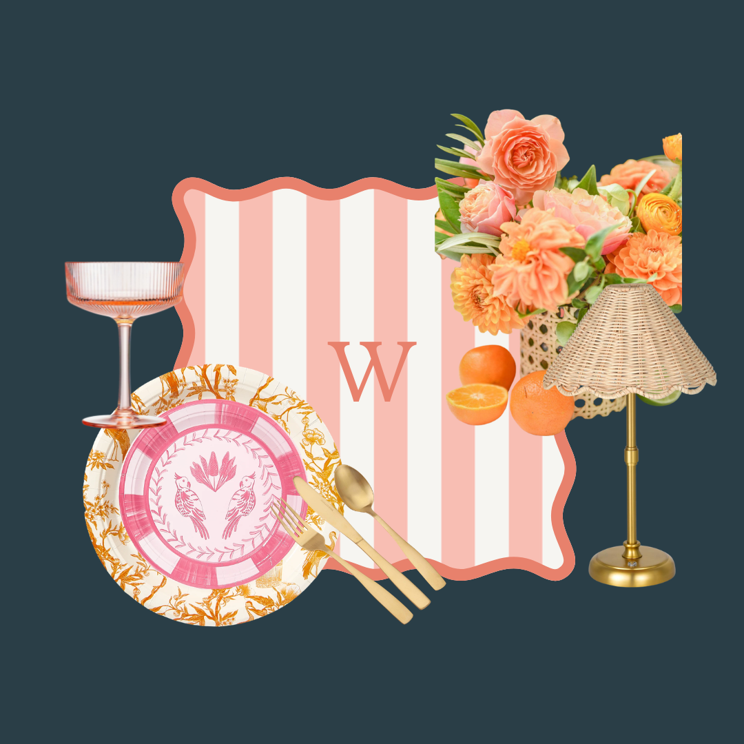
Wedding Trends for 2026 continue here at the Studio Edit with The Paloma Palette. A citrus-forward color story, the Paloma Palette features warm, sunset hues that evoke a golden hour cocktail on the beach. Think grapefruit pink, citrus orange, peach and papaya, layered with warm gold accents and beachy neutrals. The feeling is effortlessly festive and fun.
I recently hosted a bridal shower themed “She found her Main Squeeze” using this colorful palette, and it created a story that was beautiful but also playful. You can check out photos from that in my Gallery and on social media.
What I love about this color theme is that it is easy to incorporate into wedding decor, and can work with a variety of design aesthetics. Here’s a few simple ideas:
Flowers are the most obvious way to incorporate the color scheme into your wedding day. Ask your florist to incorporate sunset gradients into the arrangements with flowers that move from peach to coral to pink. Stems such as garden roses, ranunculus and freesia lend themselves to the breezy, citrus-hued feel. And don’t forget carnations - a vastly underrated flower that comes in just about any color, including hues that fit perfectly with the Paloma color scheme.
Linens: Napkins in particular are an easy, budget-friendly way to add a pop of color to your wedding reception. Whether you are using single-use or cloth, there are plenty of options to choose a single Paloma hue to tie in with your florals.
Add in small citrus details to subtly reinforce the color story. Grapefruit and orange halves are a fun (and fragrant!) way to decorate a variety of table areas. Bowls or glass vases filled with citrus with flowers tucked in are another way to incorporate the palette in a cohesive way.
Create a signature cocktail - the perfect opportunity to create an experience for your guests is with a signature cocktail, such as the Paloma, that ties into your palette and theme.
Pair the vibrant colors and fun cabana stripes with rattan and linen textures for a coastal or destination wedding. For a more modern or minimalist approach, use single stems in glass vases and a single hue for coordinating napkins as a nice contrast to white tablecloths. Or create a dreamy, romantic garden experience with slightly softer tones, vintage glassware, and plenty of candlelight for that signature Paloma Palette glow.
Don’t forget to check out Instagram and Pinterest to see how I incorporated this trend into a bridal shower and stay tuned for Part 3 of the Wedding Edit coming soon!
The Wedding Edit: Part 1
The Spring/Summer Wedding season is just around the corner, so I decided to go in search of this year’s hottest trends. According to The Knot, Gen Z is looking to have every detail chosen with personal expression in mind. They want weddings that feel less like productions and more like beautifully curated gatherings — layered, expressive, and deeply personal. Couples are moving away from “copy-and-paste Pinterest weddings” and leaning into story-driven design.
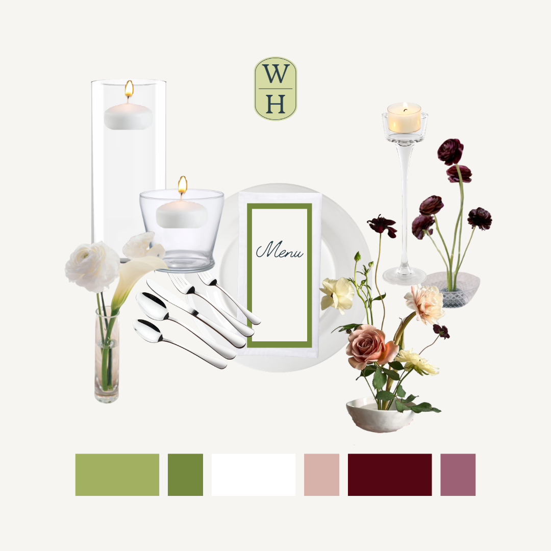
One of the biggest trends to reflect these highly personal weddings is to have reception tables styled like intimate dinner parties - with rich layering, beautifully mixed place settings, and abundant candlelight.
Luxury isn’t defined by scale or excess, according to Vogue, but by meaning. Brides are opting for microweddings (typically 50 guests or less) so that they can provide a wedding experience for their guests that is truly custom and meaningful. It allows couples to have long, lingering conversations around more relaxed dinner tables. In my next blog I will talk more about specific design items that couples are using to create these custom looks and how, as a design studio, I help clients achieve that.
Embracing the Theme
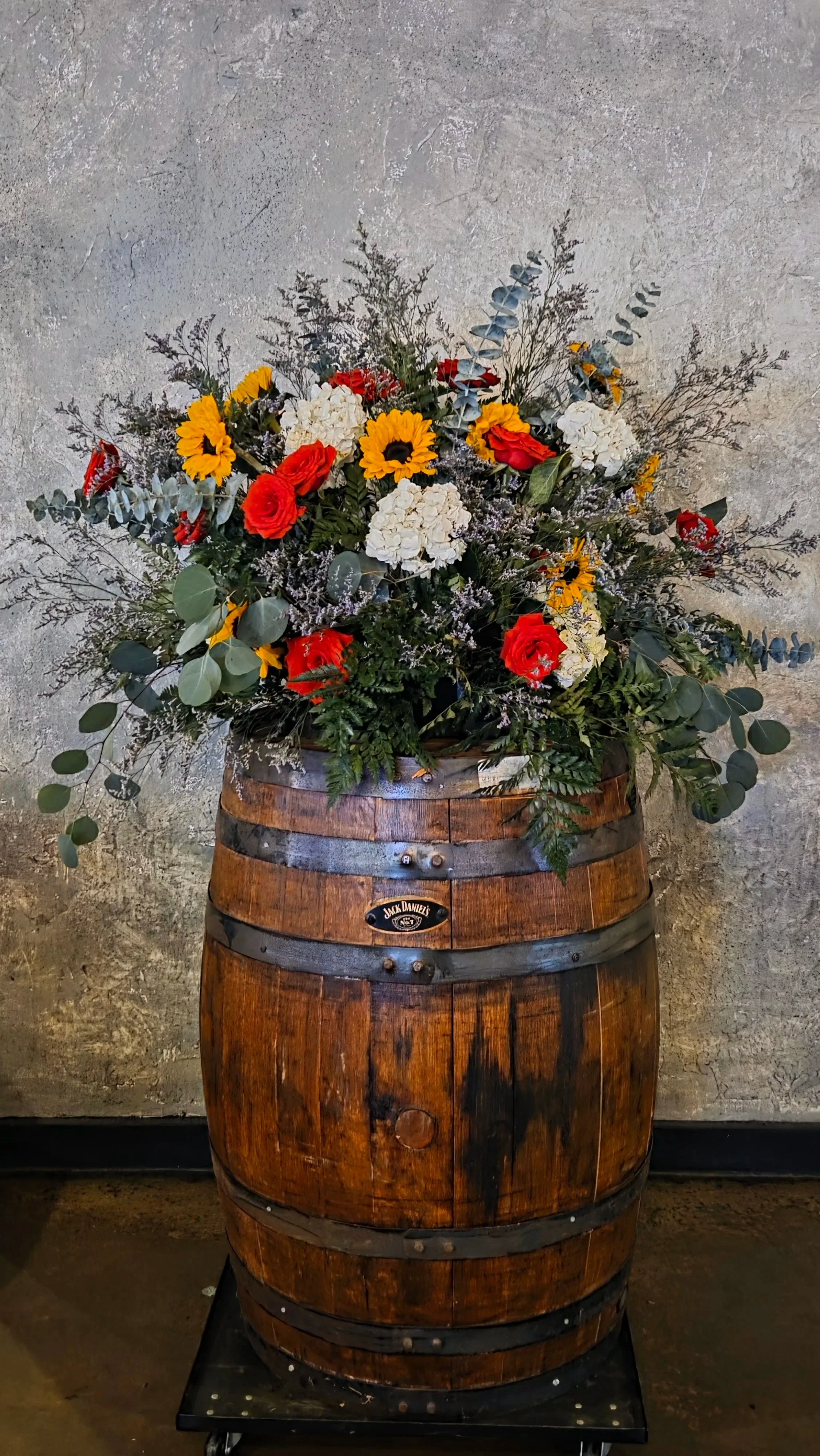
My most recent client event was hosted at a country and western venue, and rather than soften or modernize the setting, we leaned into it wholeheartedly. The result? A cohesive, immersive experience that felt intentional, elevated, and completely authentic to the space.
I often tell clients who are hosting their event at a venue or even a restaurant, to consider the aesthetic of the space and let that aesthetic drive the design.
When designing around a strong venue aesthetic, your first step is observation.
What materials dominate the space? (Wood? Metal? Brick?)
What colors are naturally present?
What is the mood — rustic, refined, relaxed, bold?
I wanted the design elements to feel like an extension of the space rather than compete with it. Large whiskey barrel arrangements created a few focal points. Arrangements in cowboy boots were intentionally placed throughout the space as a subtle nod to the venue. And table arrangements in fun, cobalt blue vases struck the perfect note between fun and elevated.
As for the flowers themselves, we chose elements that would reinforce the story. Sunflowers were the signature stem - the epitome of refined rustic style. By using them sparingly, your eye was immediately drawn to them and they created a bold yet cohesive statement through the entire space. Cohesion is created through repetition and restraint.
On another blog I’ll dive into how I create floral recipes but I’ll leave it here for now. As you start looking at venues for your event, consider the aesthetic and how that will affect the design. Not sure how to work within the aesthetic? Well, that’s why people hire me - to create a design that feels like an extension of the space but also a unique interpretation of it.
It’s not always pretty
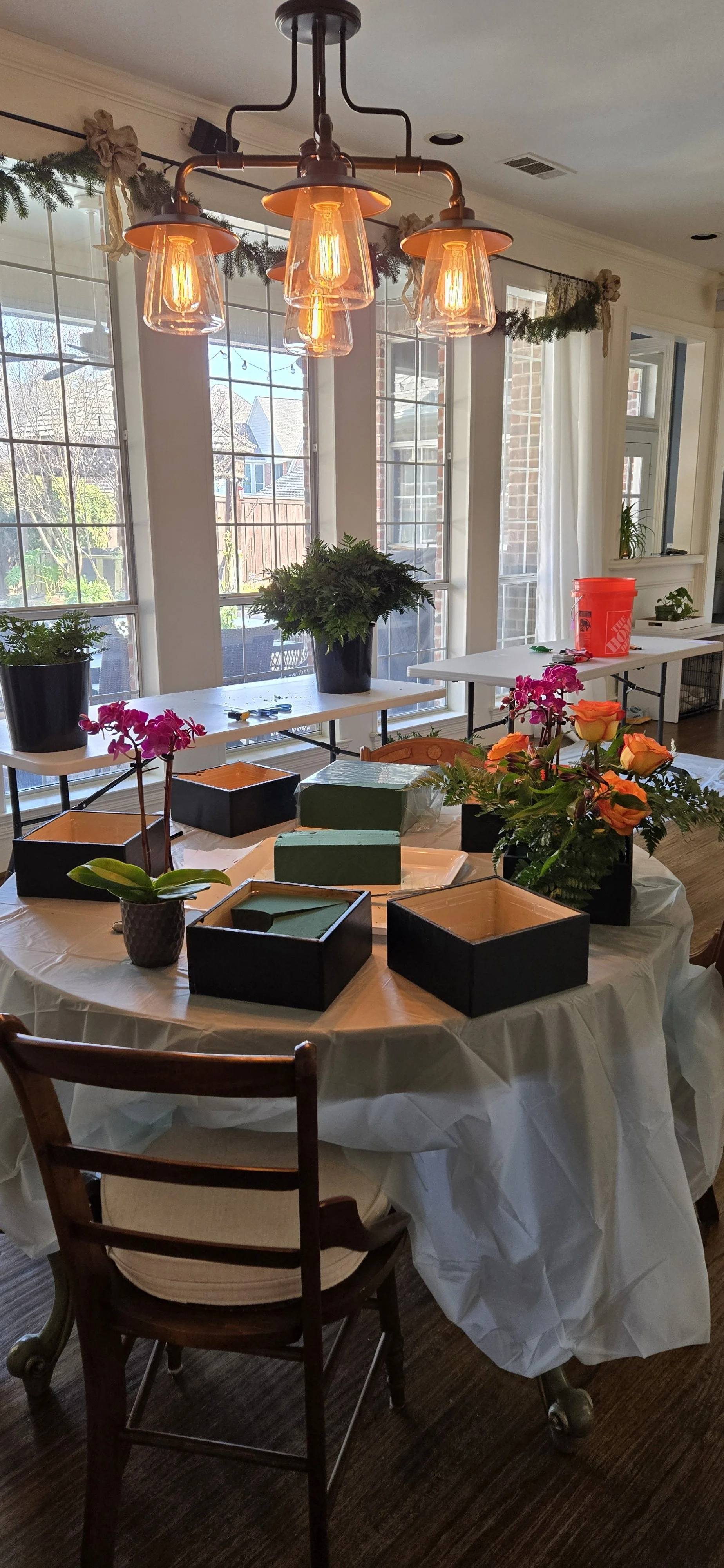
This is an event week for me. Not a sweet little bridal luncheon or birthday party. This is a full-scale large event. I am washing and bleaching buckets to keep bacteria from growing on the stems. I am prepping vases. I’ve pulled out gloves and clippers and drop cloths. Stems will be cleaned, roses will be dethorned, leaves will be stripped. I will be honest. I do not love this part of what I do. It’s messy. It’s chaotic. It’s exhausting.
For this event, I am working with volunteers and running a two-day workshop. I will be walking them through the prep work and showing them what it takes to put everything together. I get to share the messy bits with others and create teachable moments. Maybe all they take away from it is how to remove thorns or what packaging petals are. But maybe they take away something a little bit more.
Maybe they learn that just because something is messy doesn’t mean there’s something wrong. Maybe they learn that the process is just as important as the final product.
There really is a lot that goes on behind the scenes to make these events beautiful and memorable and special. It’s definitely hard work and it most certainly is not always pretty. But when it all comes together, and you see the delight and joy on people’s faces when they take in the beauty of the event, the chaos is worth it.
Think Outside the Box
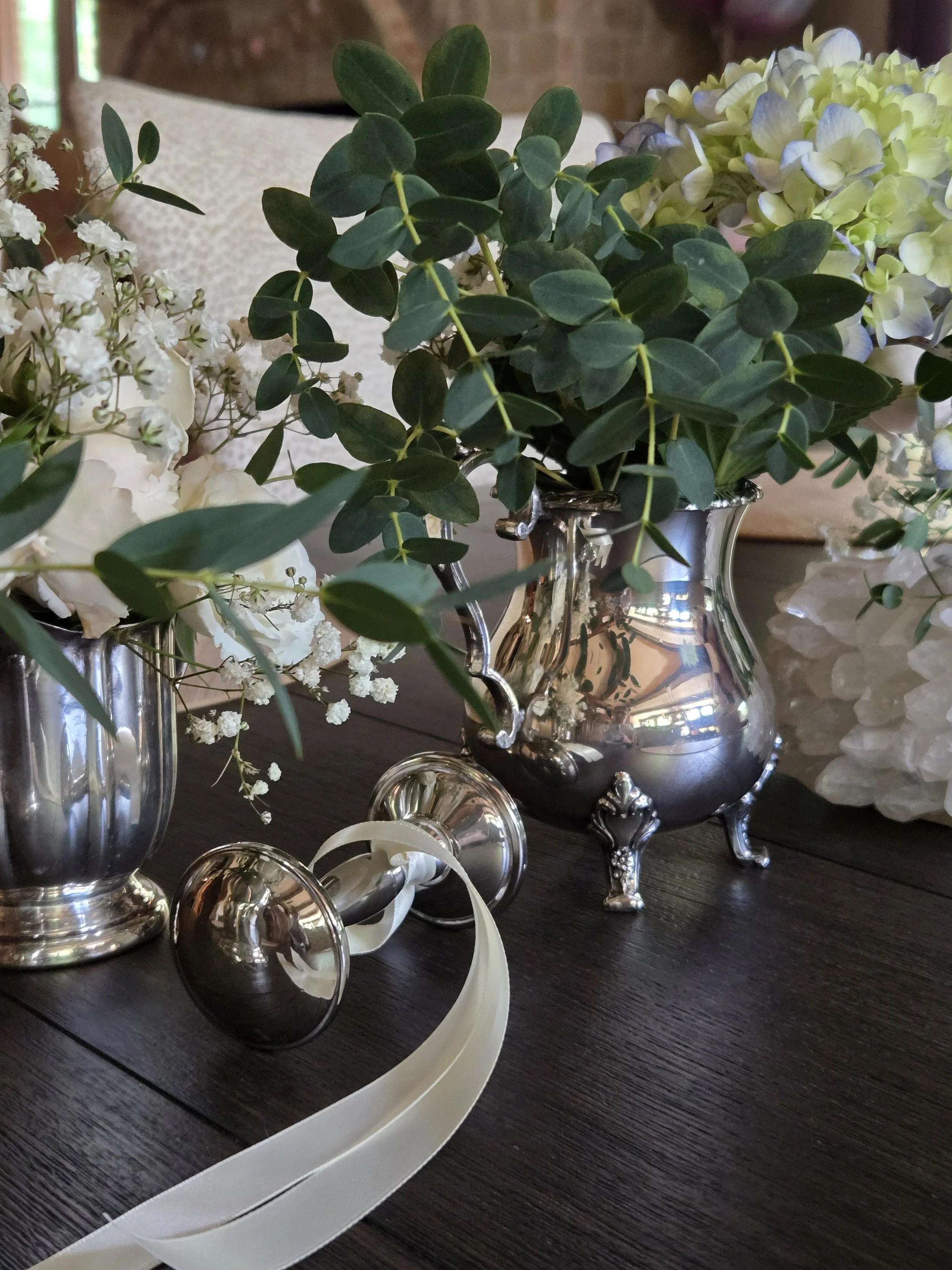
A few years ago, a client asked me to do the tablescapes for a Beatrix Potter- themed gender reveal. The mom-to-be wanted a classic, English garden feel, and I immediately knew that vintage silver would be the perfect way to execute this theme.
One of the easiest ways to elevate a tablescape is to swap standard vases for unexpected containers. Thinking outside the box here adds character and quietly reinforces the theme.
For this client, using vintage silver tea pots, sugar and creamer sets, and even silver baby cups, created a collected look and a sense of nostalgia. Vintage or heirloom-inspired containers add emotional weight to an event, especially one celebrating new life. They feel sentimental, even if they weren’t passed down.
When using unique containers, repetition matters. Sticking to one material—like silver—keeps the look cohesive even when shapes vary. Using a variety of pieces such as taller teapots, mid-sized creamers, and petite baby cups, creates visual interest and movement across the table.
So where to start? When trying to find unique containers, start by looking around your house to see what you may already have that can be used. You’d be surprised by what can be turned into a floral container! Browse thrift stores or antique malls. Once you find one or two pieces you can hone your search for additional ones.
When choosing flowers, make sure you keep them scaled for the container. You want unique vessels to be part of the floral design, not hidden by the arrangement itself. Here, small baby cups held a single rose, a sprig of greenery, and just a hint of baby’s breath. They looked so sweet scattered on the tables. Larger florals such as hydrangeas were reserved for the larger tea pots.
When you think outside the box and choose more unique containers for the flowers, you invite guests to lean in, reminisce, and connect. And that’s the true magic of a well-designed table.
Something Borrowed, Something Blue
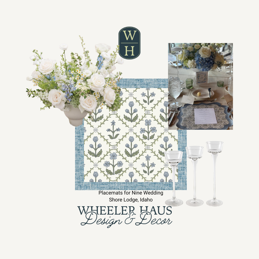
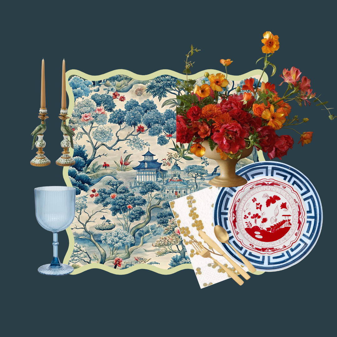
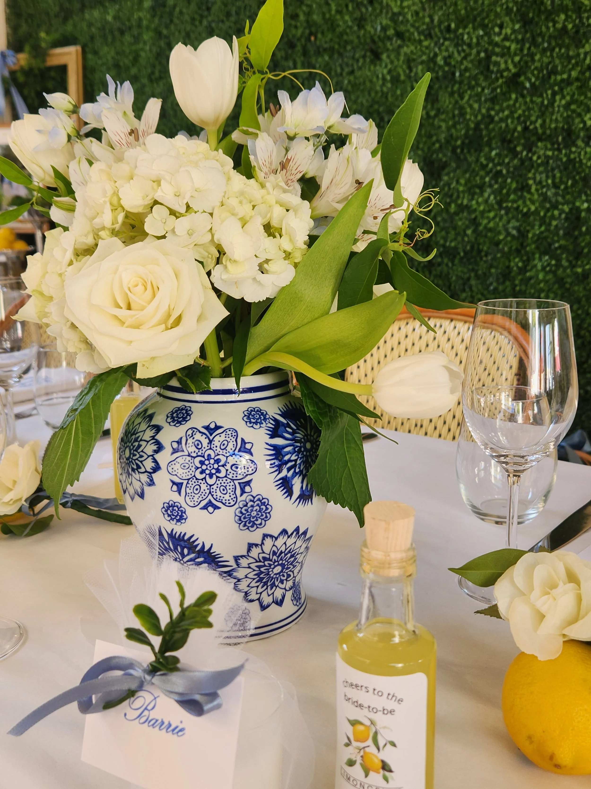
“Something old, something new, something borrowed, something blue.” This old English poem transcends time and culture, inspiring brides to incorporate these elements into their wedding. Perhaps this is why blue and white is such a timeless color palette and a popular choice of brides.
A lot of my client work is within the wedding space, and I’ve done multiple iterations of this timeless color combo. It’s the power couple of tablescapes. It can be breezy, sophisticated, or modern.
Why is blue and white so popular? The palette feels familiar and comforting yet always refined. It never reads “trendy,” which makes it especially appealing for weddings meant to feel classic years later. White brings purity and light; blue adds depth and calm. Together, they strike a perfect balance between crisp and romantic.
Blue and white is also one of the most versatile color palettes. It works in every season and setting: from breezy coastal venues, European‑inspired gardens, or winter ballrooms.
There are so many ways you can incorporate “something blue” into your color story. Whether you choose the soft blue of hydrangeas or delphinium, a bold blue and white chinoiserie vase, or custom placemats with the perfect shade of blue, you can create a cohesive theme that feels intentional without being overwhelming. To see some of the client events that use this dynamic duo, check out my gallery or my instagram!
Back to the Basics
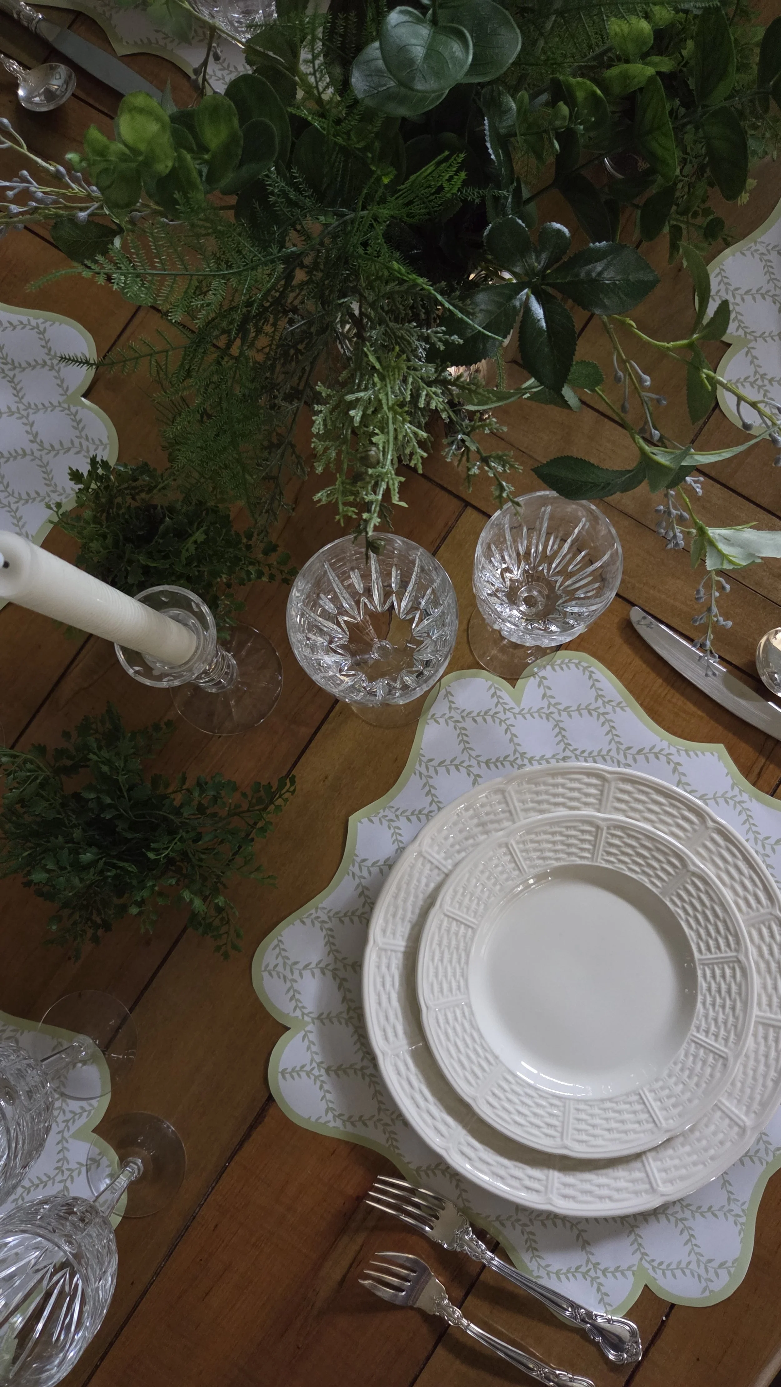
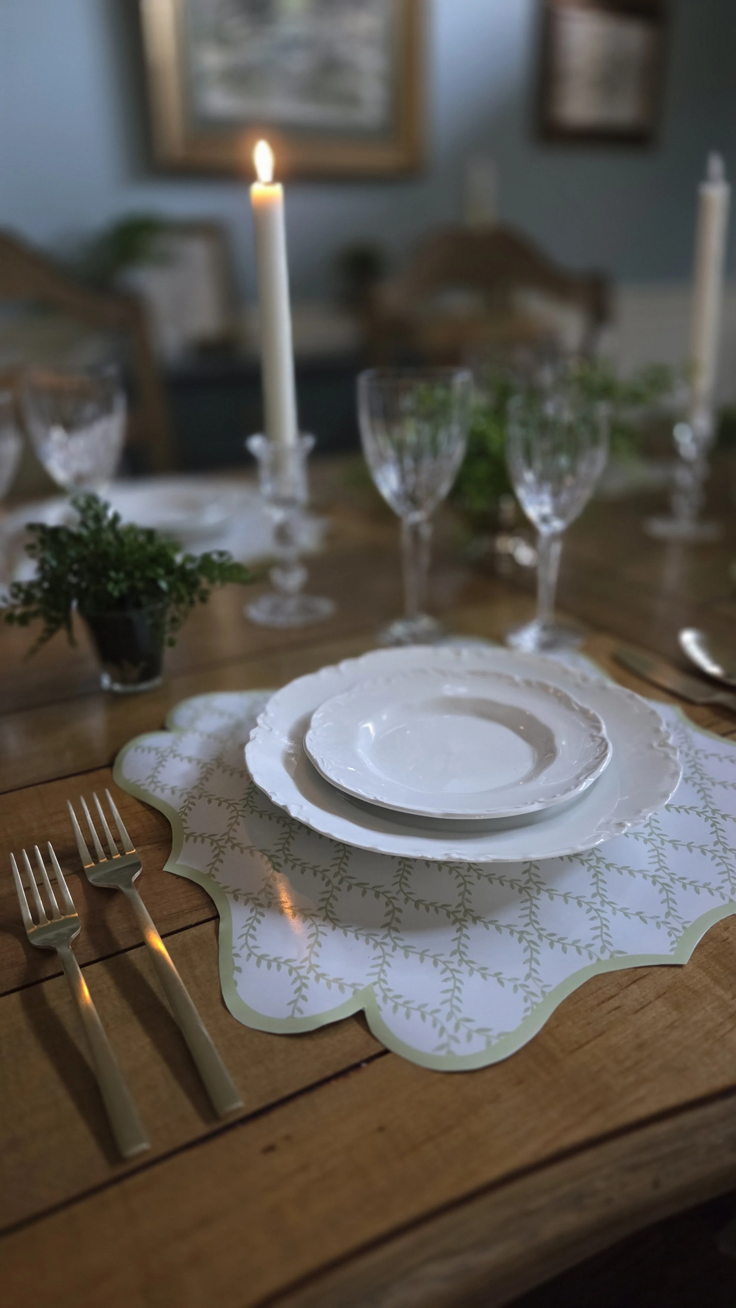
January invites us to pause and reset, and our tables can do the same. After the layers and sparkle of the holidays, returning to a simple table feels calm, intentional, and grounding. It’s a reminder that elegance doesn’t require excess—just thoughtful choices. I truly lean into my all-white dishes and neutral and simple tables.
White dishes are the ultimate foundation. Not only are there amazing options that are both affordable and accessible, but you can also find dishes that complement any style aesthetic and easily pull together an effortless table. White dishes adapt beautifully and never feel out of place.
One of the greatest strengths of a tablescape with simple white dishes is its ease. You can build it with pieces you likely already own and adjust it effortlessly for everyday meals or casual entertaining. It’s approachable, flexible, and refreshingly low-pressure.
When the palette is simple, small details shine. A folded linen napkin, a natural element, or soft candlelight adds warmth without complicating the design. These quiet touches are what make a table feel welcoming and lived-in.
At its heart, this back-to-basics approach is about creating a table that feels comfortable and inviting. One that encourages lingering, conversation, and connection.
Quiet Reflection
For me, January is a month to exhale, sit quietly, and let the noise of the holidays fade before inviting inspiration back in. I favor simple, neutral tablescapes over the explosion of color and pattern- on- pattern tables that are typically my signature style. This is the month I go back to the basics. When a table is layered with fewer elements, I notice my thoughts slow down too. Open space, neutral tones, and simple textures give my mind room to wander and rest.
January tables often come together from pieces I have had for years. Reusing and reimagining familiar items feels grounding and reminds me that creativity doesn’t always require something new. A piece of vintage silver, or crystal candlesticks I have had for 30 years feels calming somehow.
These quieter tables aren’t about impressing or styling for a moment. They’re about creating for myself, letting intuition guide me, and enjoying the process without expectations. I look forward to sharing a few simple tables with you!
Pull up a Chair…
There’s something powerful about the dinner table. It’s where we gather, celebrate, and connect. It’s a place where we can linger, enjoy meaningful conversation, and make memories. And for me, it’s a place where I can express myself creatively.
Some of my most cherished childhood memories happened around the fun and beautiful tables my mother set for us, and that inspired me to create those memories for my own children. In 2022, I decided to turn that passion for beautiful tables into a business designed to help others create special moments of their own.
If you are new here, my name is Amy Wheeler, owner of Wheeler Haus Design& Decor, a unique design studio focused on tablescape design. Tablescapes are more than just pretty plates and flowers. It’s about creating a feeling - a moment in time.
I started this blog as a new way to connect with clients, fellow creatives, and anyone who loves hosting, entertaining, or simply making everyday moments feel a little more special. Whether I’m designing an intimate dinner, a milestone celebration, or a large-scale event, my goal is always the same: to create tables that feel warm, approachable, and thoughtfully layered.
My design philosophy is rooted in accessibility. I believe beautiful tables don’t have to be expensive or overdone. I love mixing high and low elements, repurposing pieces in unexpected ways, and finding small details that make a big impact. A great table should feel welcoming, not precious—designed to be used, enjoyed, and remembered.
Here on The Studio Edit, I’ll be sharing a mix of inspiration and practical ideas, from flower arrangements and place settings to behind-the-scenes looks at real events I design for clients. You’ll find styling ideas you can actually recreate, and a glimpse into the process that happens long before guests ever take their seats.
This space is meant to feel like a conversation—one where creativity is shared generously and beauty feels attainable. I hope it inspires you to gather more often, set the table with intention, and find joy in the details.
Thank you for being here. I can’t wait to show you what’s coming next!